In this article
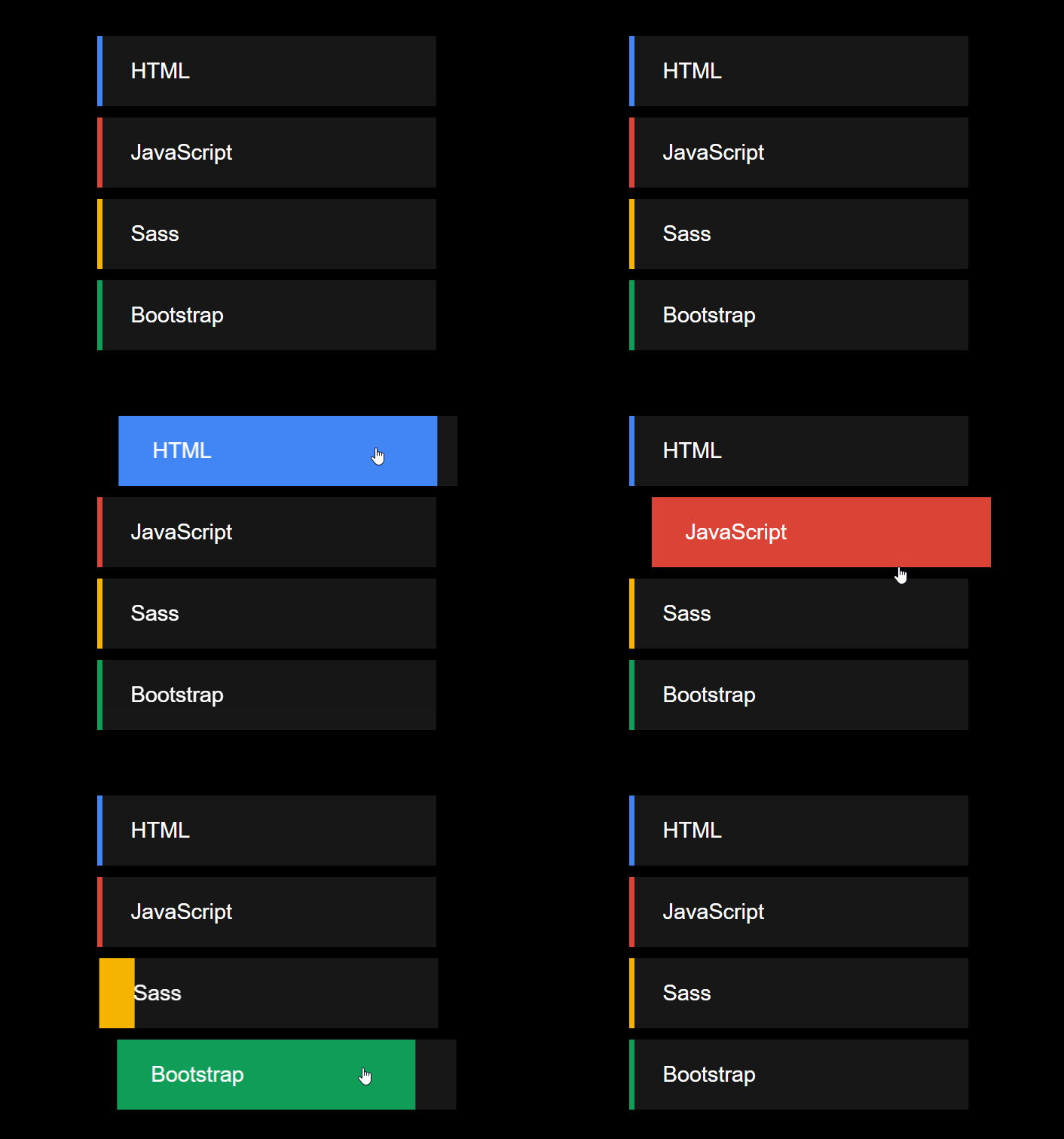
Let's discover together how to create an animated list on hover!
Step 1
Let's handle the HTML.
HTML
<ol>
  <li>HTML</li>
  <li>JavaScript</li>
  <li>Sass</li>
  <li>Bootstrap</li>
</ol>
We just need a list! (Astonishing, isn't it?)
Step 2
Let's move on to the CSS and style the list.
CSS
ol {
    width: 300px;
    list-style: none;
}

ol li {
    font-size: 1.2rem;
    padding: 20px 30px;
    margin: 10px 0;
    background: rgb(23, 23, 23);
    z-index: 5;
    position: relative;
    cursor: pointer;
    transition: all .4s;
}
We give our list a simple look: it has no bullets and we ensure that each list item is wrapped in a full block with margins and a background.
The z-index: 5 will allow us in the next step to overlay the small border on the left side relative to the text, without it covering the entire item on hover (it is actually a pseudo-element ::before).
Step 3
Let's now style the border.
CSS
ol li::before {
    content: "";
    position: absolute;
    top: 0;
    left: 0;
    width: 5px;
    height: 100%;
    z-index: -1;
    transition: all .4s;
}

ol li:hover::before {
    width: 100%;
}
This allows us to define a different colored shadow for each list element.
Step 4
Let's define a different color for each list item.
CSS
ol li:nth-child(1)::before {
    background: #4285f4;
}

ol li:nth-child(2)::before {
    background: #db4437;
}

ol li:nth-child(3)::before {
    background: #f4b400;
}

ol li:nth-child(4)::before {
    background: #0f9d58;
}
Step 5
Let's shift the list element when it is hovered over.
CSS
ol li:hover {
    transform: translateX(20px);
}
Category: Developers