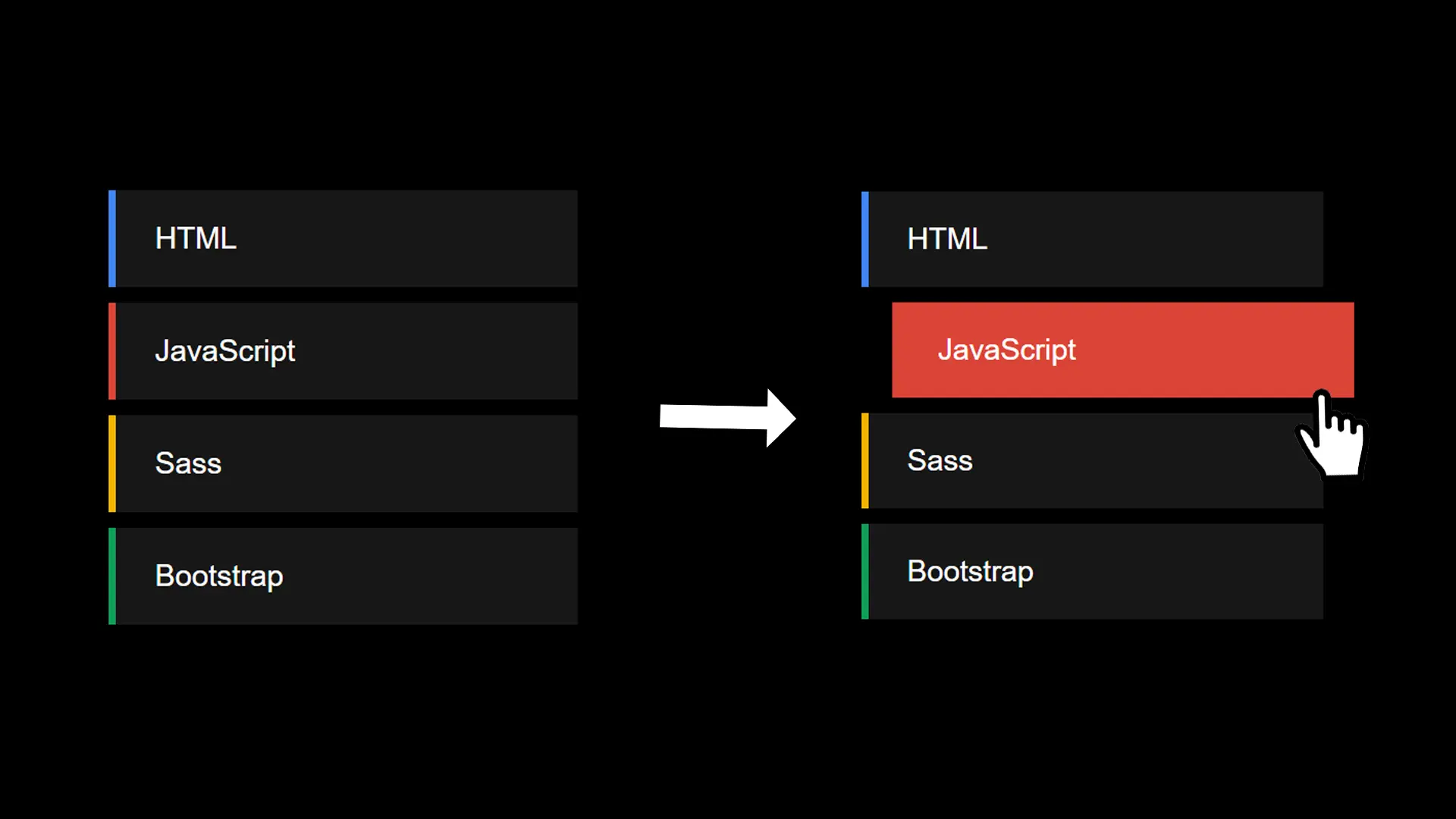
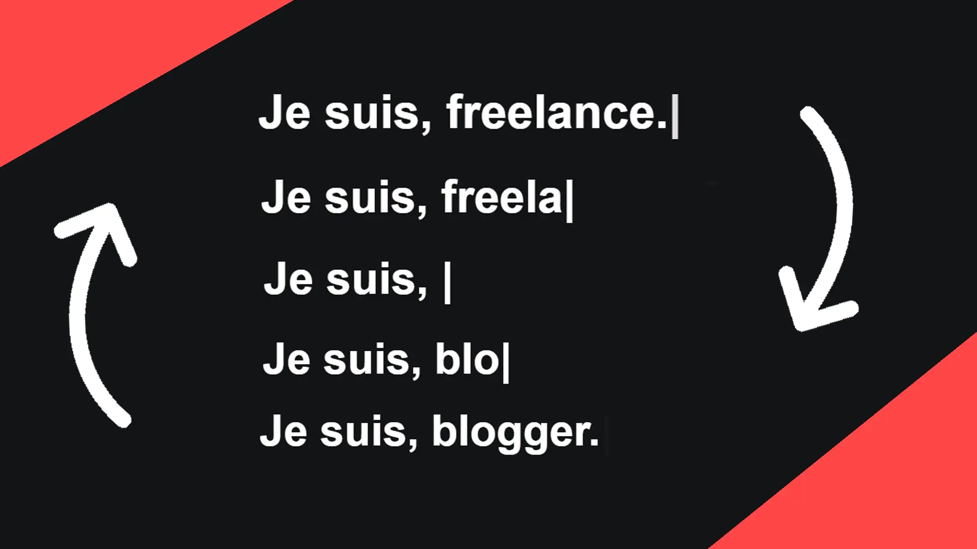
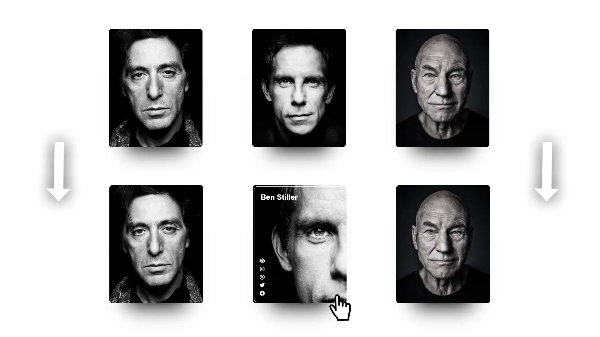
For a slogan or for an animation on a very important page of your project, this very modern effect is also very simple to achieve. Let's analyze together how to do it in this article.
Step 1
The HTML code.
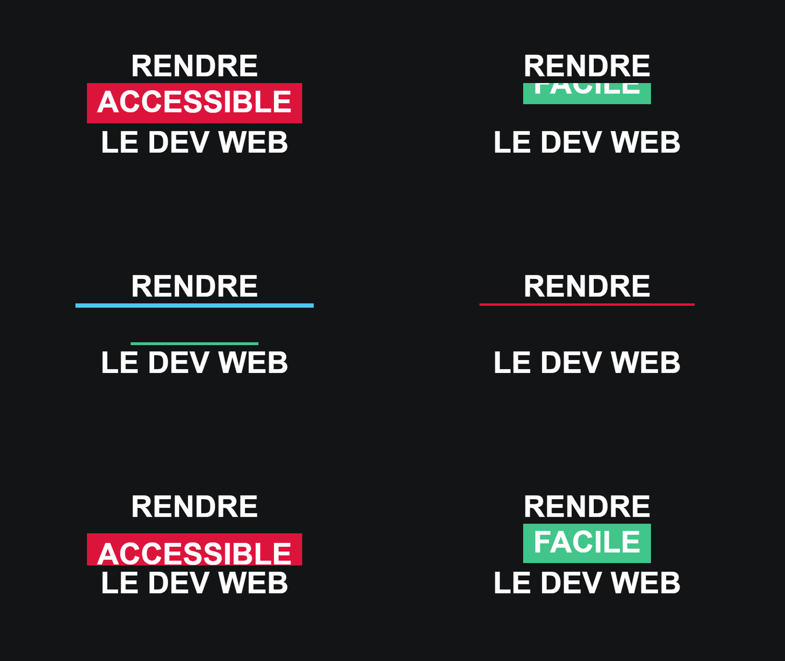
Render
<div id="flip">
  <div><div>passionate</div></div>
  <div><div>easy</div></div>
  <div><div>accessible</div></div>
</div>
web dev
We have a lot of div tags, yes, but they allow us not to bloat the code with classes on every line.
Step 2
Let's style the page.
* {
  margin: 0; padding: 0;
  box-sizing: border-box;
}

body {
  font-family: arial, sans-serif;
  background: #131416;
  display: flex; align-items: center;
  justify-content: center;
  height: 100vh; color: #fff;
  flex-direction: column;
  font-size: 36px; font-weight: bold;
  text-transform: uppercase;
}
Step 3
Let's continue with the divs and the id flip.
#flip {
  height: 50px;
  overflow: hidden;
  text-align: center;
}

#flip > div > div {
  padding: 4px 12px;
  height: 50px;
  margin-bottom: 45px;
  display: inline-block;
}
In this step, we define the height of the area that will display each of the written words one after the other.
We use overflow: hidden to hide the other words so that only one is shown.
Step 4
Let's style each div to give it a different background.
#flip div:first-child {
  animation: show 5s linear infinite;
}

#flip div div {
  background: #42c58a;
}
#flip div:first-child div {
  background: #4ec7f3;
}
#flip div:last-child div {
  background: #DC143C;
}
For 5 seconds, we will play with margin-top and the height of the flip class to display each word.
Step 5
Let's create the show animation to finish.
@keyframes show {
  0% {margin-top: -270px;}
  5% {margin-top: -180px;}
  33% {margin-top: -180px;}
  38% {margin-top: -90px;}
  66% {margin-top: -90px;}
  71% {margin-top: 0px;}
  99.99% {margin-top: 0px;}
  100% {margin-top: -270px;}
}
For 5 seconds, we will play with margin-top and the height of the flip class to display each word.