Create an animated gradient background on hover avec CSS

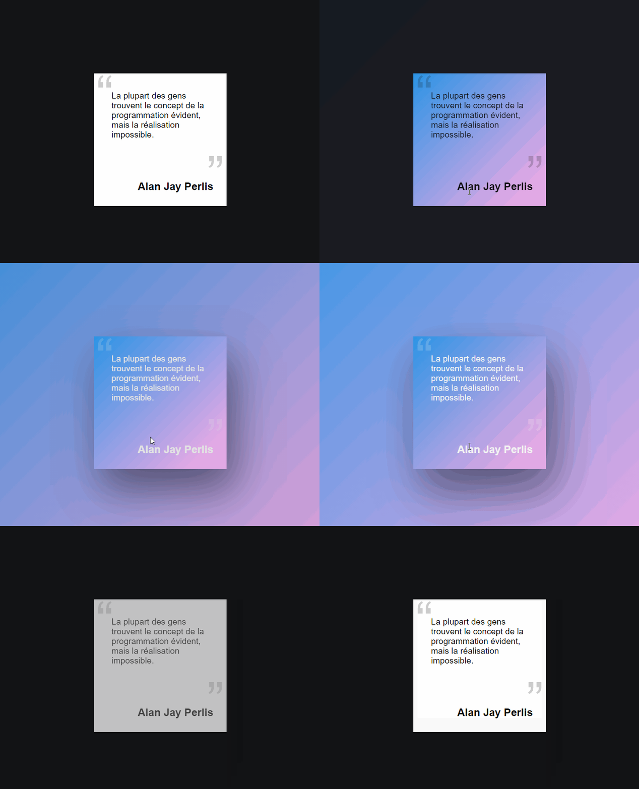
Whether it's to highlight a part of your website or a quote as in this example, generating and adding a gradient to the background can give your website a very modern touch. Find out in this article how to do it easily!
•
Updated on August 14, 2026
•
2 min read
Believemy logo

Whether it's to highlight a part of your website or a quote like in this example, generating and adding a gradient to the background can give a very modern touch to your website. Let's discover in this article how to achieve this easily!
Image


Step 1

The HTML code.

HTML
<div class="box">
    <p>Most people find the concept
   of programming obvious, but the realization
   impossible.</p>
    <h2>Alan Jay Perlis</h2>
</div>

<div class="background"></div>


Step 2

Let's style the box (.box).

CSS
.box {
  position: relative;
  width: 300px;
  height: 300px;
  background: white;
  transition: all 0.5s;
  z-index: 2;
  padding: 30px;
}


Step 3

Add the opening quotation mark.

CSS
.box::before {
  content: '\201C';
  position: absolute;
  top: -20px;
  left: 5px;
  width: 100%;
  height: 100%;
  font-size: 120px;
  opacity: 0.2;
}

The \201C code allows us to display an opening quotation mark.


Step 4

Now, let's add the closing quotation mark.

CSS
.box::after {
  content: '\201D';
  position: absolute;
  bottom: 0;
  right: 5px;
  font-size: 120px;
  opacity: 0.2;
}


Step 5

Let's style the text and the title.

CSS
.box p {
  margin: 0;
  padding: 10px;
  font-size: 1.2rem;
}

.box h2 {
  position: absolute;
  margin: 0;
  padding: 0;
  bottom: 30px;
  right: 30px;
  font-size: 1.5rem;
}


Step 6

Let's animate the box style on hover with the mouse.

CSS
.box:hover {
  color: #f2f2f2;
  box-shadow: 20px 50px 100px rgba(0, 0, 0, 0.5);
}

Here, we change the text color and the author's name when we hover the cursor over the box.


Step 7

Let's now style the background.

CSS
.background {
  position: absolute;
  top: 0;
  left: 0;
  z-index: 1;
  opacity: 0;
  transition: all 0.5s;
  width: 100%;
  height: 100%;
}


Step 8

Let's finish this effect with the design of the menu.

CSS
.box:hover, .box:hover ~ .background {
  opacity: 1;
  background: #e2a9e5;
  background: -moz-linear-gradient(-45deg, 
  #e2a9e5 15%, #2b94e5 100%);
  background: -webkit-linear-gradient(-45deg, 
  #e2a9e5 15%,#2b94e5 100%);
  background: linear-gradient(-45deg, #e2a9e5
  15%,#2b94e5 100%);
}

Here, we manage the display of the text with the color change when the cursor hovers over the box.
We will also manage the display of the background, creating this gradient effect between the colors.
Category: Developers

Share this article

Want to help us? Share this article on your networks or even better: on your site, in an article or in your newsletter.

Believemy logo
Comments (0)

You need to be logged in to comment on this article: log in or sign up.

Read next

Creating an animated list with CSS

Let's find out how to create an animated hover list!

December 9, 2024

Create an animated "rainbow" button with CSS

In this article, we'll show you how to create a rainbow button that comes to life when the mouse hovers over it. A modern and sensational effect guaranteed!

December 9, 2024

Creating circled buttons on hover with HTML and CSS

For a menu or to encourage your readers to share your website, share buttons are essential elements to add to your website. Let's find out how to make them more modern with a "neon" effect that will surround the icon selected by your user.

December 9, 2024

Create a map displaying links on mouse-over with CSS

To present your team or simply yourself, this animation will allow you to display the links to your social networks when you hover over the map: a striking effect guaranteed! Let's find out how to do it together.

December 9, 2024

Create hover text on image with CSS

We've already seen how to create an element that is displayed when the mouse hovers over an image, but in this article we'll show you how to display a whole host of information very fluidly by hovering the mouse over an element!

December 9, 2024

Creating a cascading animation on text

For a slogan or for an animation on a very important page of your project, this very modern effect is also very easy to achieve. Let's take a look at how to do it in this article.

December 9, 2024

Creating animated borders and rainbow blurs with CSS and JavaScript

Think again: it's not a shadow, it's a trick that will make your visitors think you've added borders and animated rainbow shadows! It's nothing of the sort: no borders or shadows are used in this tutorial. Let's discover the secret behind this trick.

December 9, 2024

Creating a hovered with CSS

In this tutorial we'll look at how to create an overlay easily using CSS!

December 9, 2024

Become the solopreneur you dream of being.

First project, career change, business launch: access our courses, practice on real-world cases, and move forward with clear guidance.