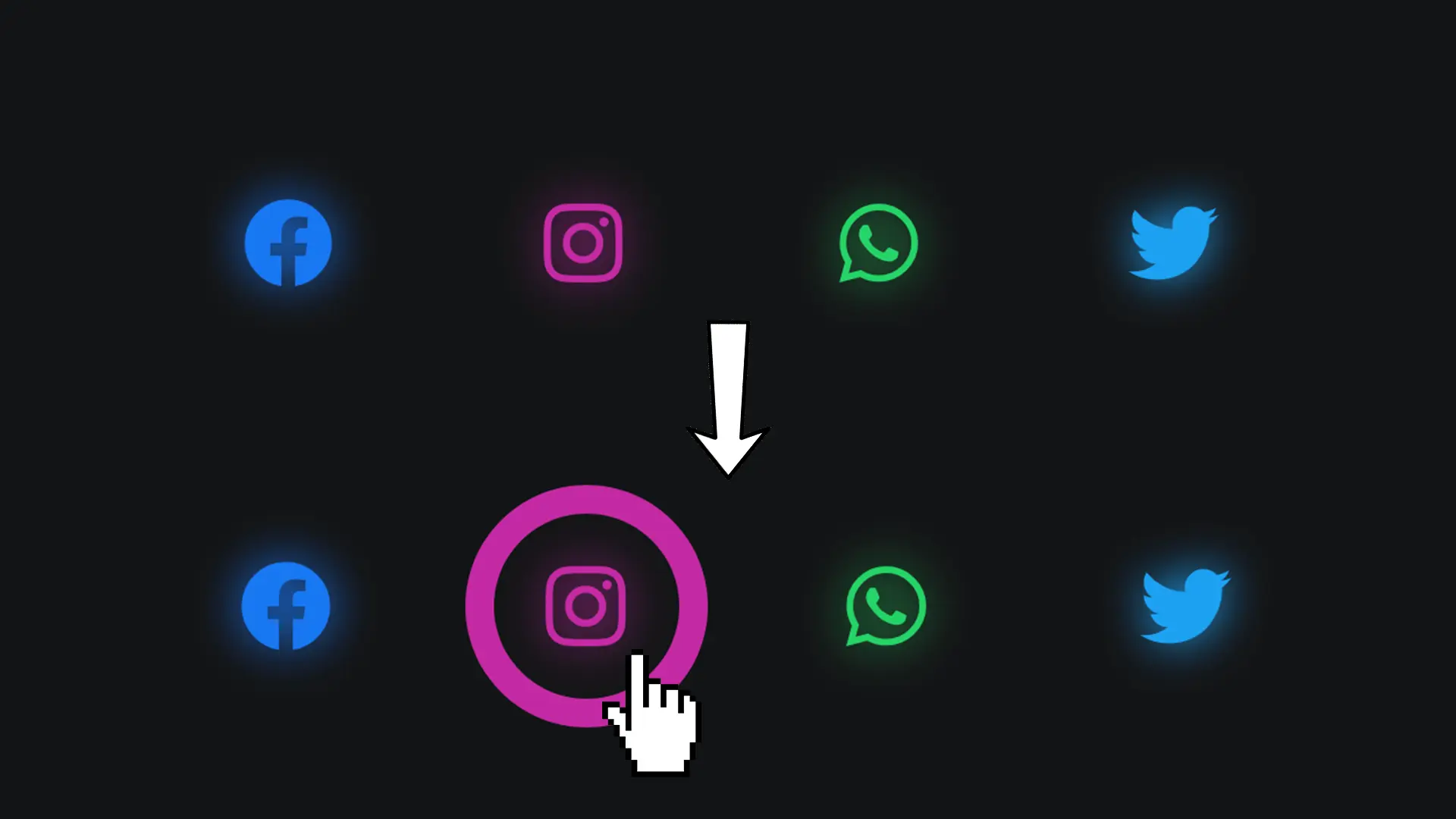
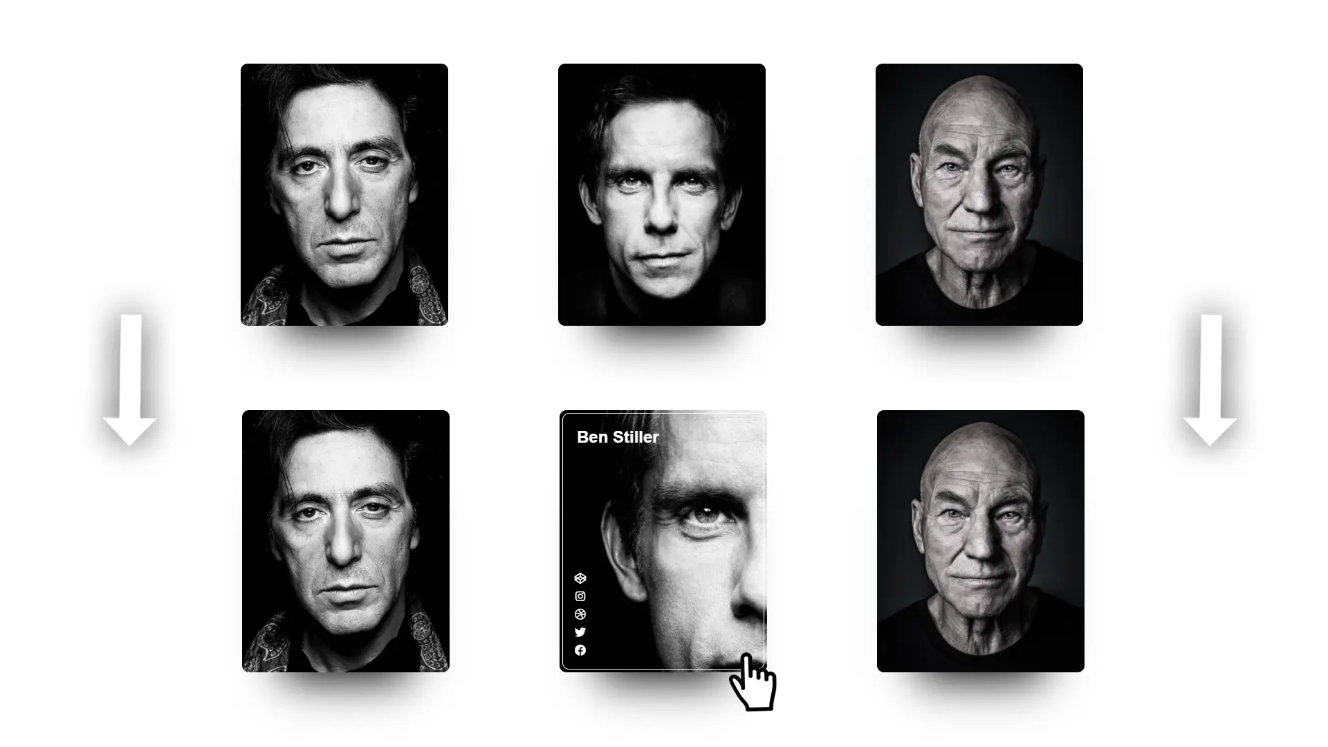
To present your team or simply yourself, this animation will allow you to display links to your social networks when hovering over the card: a striking effect guaranteed! Let’s discover how to achieve this together.

Step 1
We are going to need to include Font Awesome 5. This library will allow us to add social network icons.
<link rel=”stylesheet” href=”https://cdnjs.cloudflare.com/ajax/libs/font-awesome/5.15.1/css/all.min.css”>
Step 2
The HTML code.
<div class="card">
  <div class="informations">
    <img src="https://cdn.vox-cdn.com/thumbor/nDW7YqKV8soKsZSfRorGXJLSH50=/1400x1400/filters:format(jpeg)/cdn.vox-cdn.com/uploads/chorus_asset/file/22147179/1229892934.jpg" alt="Elon Musk">
    <h1>Elon Musk</h1>
    <h2>Serial Entrepreneur</h2>
  </div>
  <div class="icon">
    <a href="#"><i class="fab fa-instagram fa-2x"></i></a>
    <a href="#"><i class="fab fa-github fa-2x"></i></a>
    <a href="#"><i class="fab fa-twitter fa-2x"></i></a>
  </div>
</div>
Thanks to the Font Awesome library we added in the first step, each class starting with “fa” will be retrieved and transformed into an icon.
The class fa-2x allows doubling the size of the icon.
You can find all available icons on fontawesome.com/icons.
Step 3
Let's style the "share" button.
.toggle {
  width: 50px;
  height: 50px;
  background: #c70039;
  border-radius: 50%;
  cursor: pointer;
  position: relative;
}

.toggle::before {
  content: '\f1e0';
  width: 100%;
  height: 100%;
  position: absolute;
  color: white;
  font-family: 'Font Awesome 5 Free';
  font-weight: 900;
  text-align: center;
  line-height: 50px;
  font-size: 22px;
}
It is very important to add the font 'Font Awesome 5 Free' and specify that we want to use a bold font (font-weight) of 900.
Step 4
Let's now style the bullet list of our button.
.share.active .toggle::before {
  content: '\f00d';
  font-size: 2rem;
}
.share {
  position: fixed;
  bottom: 70px;
  right: 70px;
}
.share ol {
  position: absolute;
  width: 50px;
  height: 50px;
}
Step 5
Let's style each link.
.share ol li {
  position: absolute;
  width: 50px;
  height: 50px;
  background: white;
  display: flex;
  align-items: center;
  justify-content: center;
  border-radius: 50%;
  transition: all .3s;
  opacity: 0;
}

.share ol li a {
  color: black;
}

.share.active ol li {
  opacity: 1;
  transition: all .3s;
}
Step 6
Let’s shift each item a certain distance to make them appear from each side of our button.
.share.active ol li:nth-child(1) {
  transition-delay: .1s;
  transform: translateX(60px);
}

.share.active ol li:nth-child(2) {
  transition-delay: .2s;
  transform: translateY(60px);
}

.share.active ol li:nth-child(3) {
  transition-delay: .3s;
  transform: translateX(-60px);
}

.share.active ol li:nth-child(4) {
  transition-delay: .4s;
  transform: translateY(-60px);
}
Step 7
Let’s finish our share button by detecting the user's click to add or remove the active class.
const toggle = document.querySelector('.toggle');

toggle.addEventListener('click', () => {
  const shareBtn = document.querySelector('.share');
  shareBtn.classList.toggle('active');
});
When we click on the "share" button, we ask our browser to add the "active" class if it is present. Otherwise, we ask to remove it using toggle().
Want to Go Further
If you want to go further, for example, to position your button relative to other elements on your page, nothing is better than doing it with the incredible CSS Flexbox functionality.
Go take a look at our complete Flexbox guide to learn how to position your button.