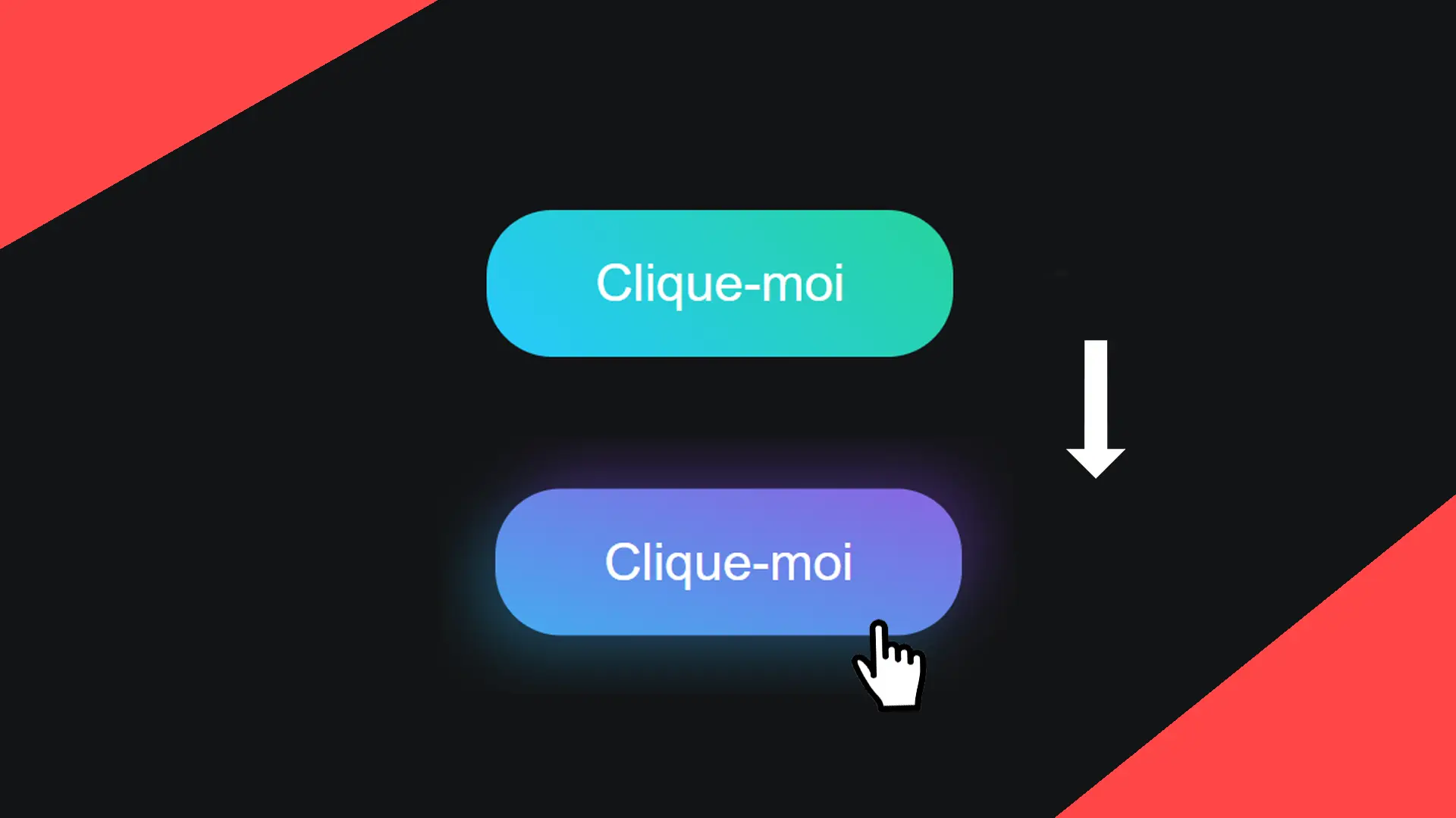
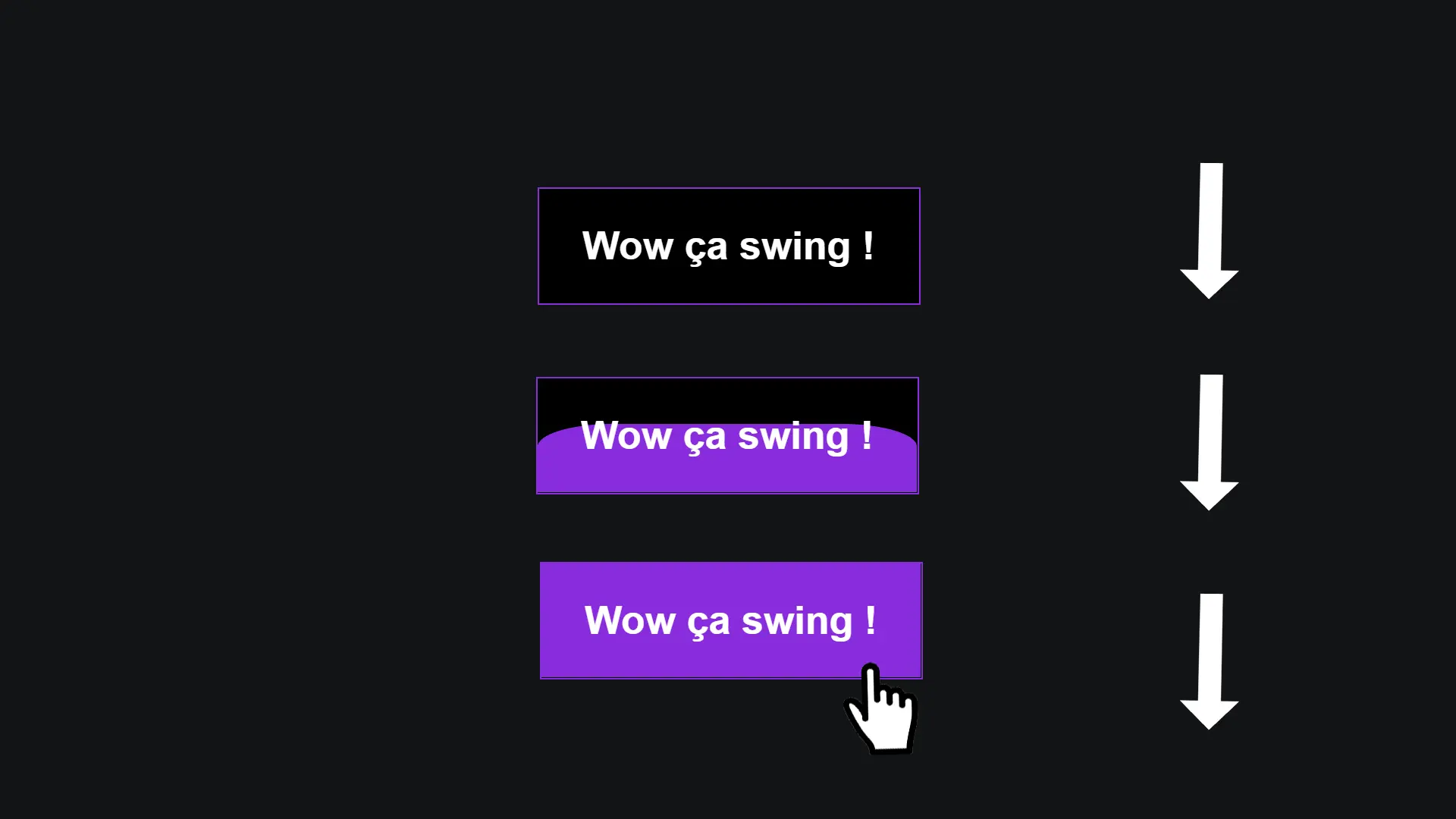
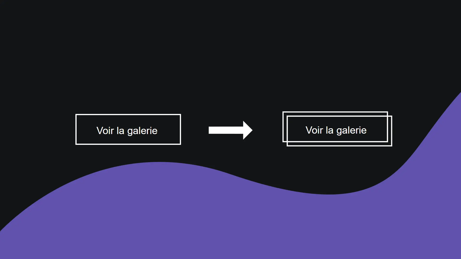
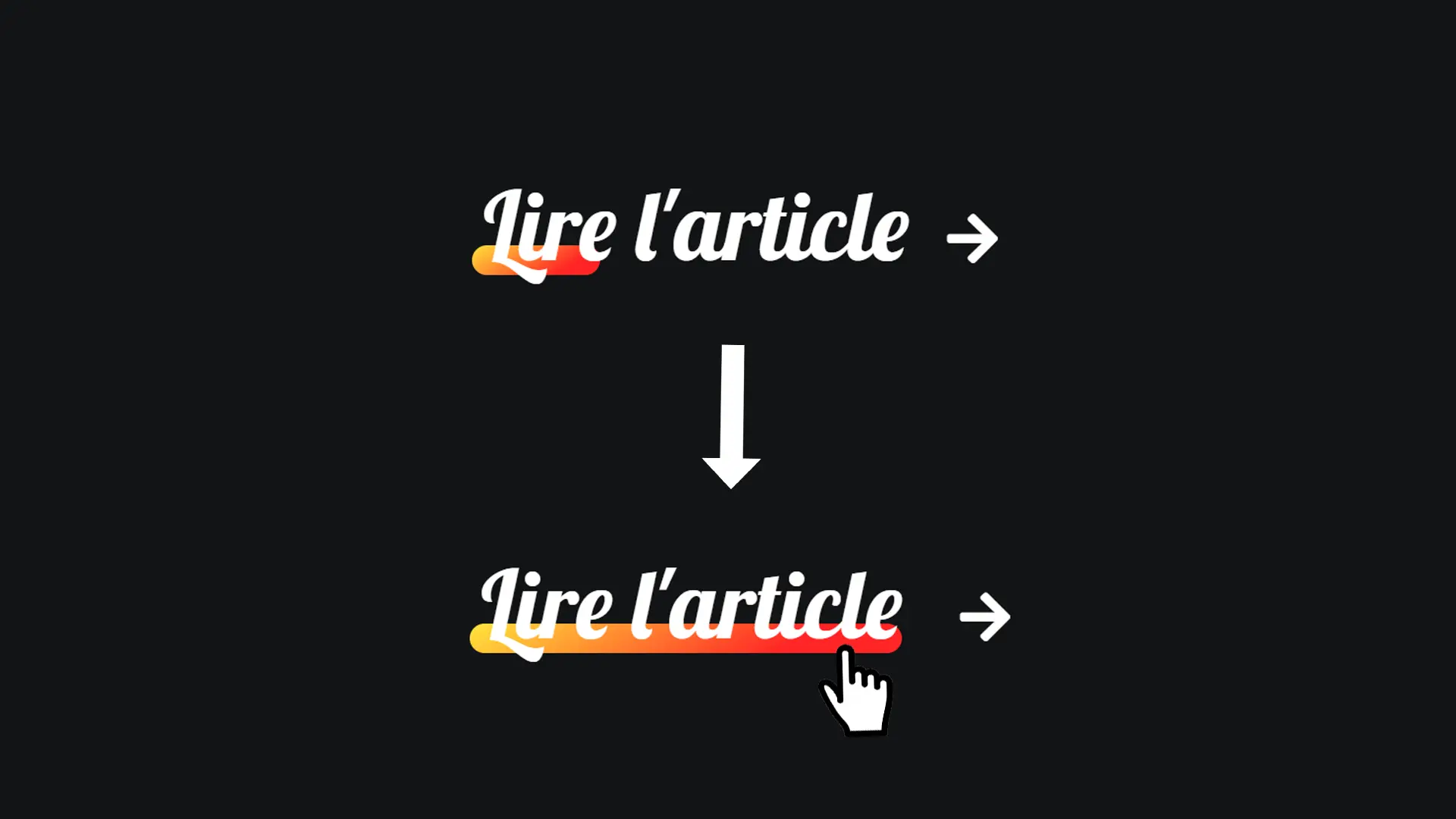
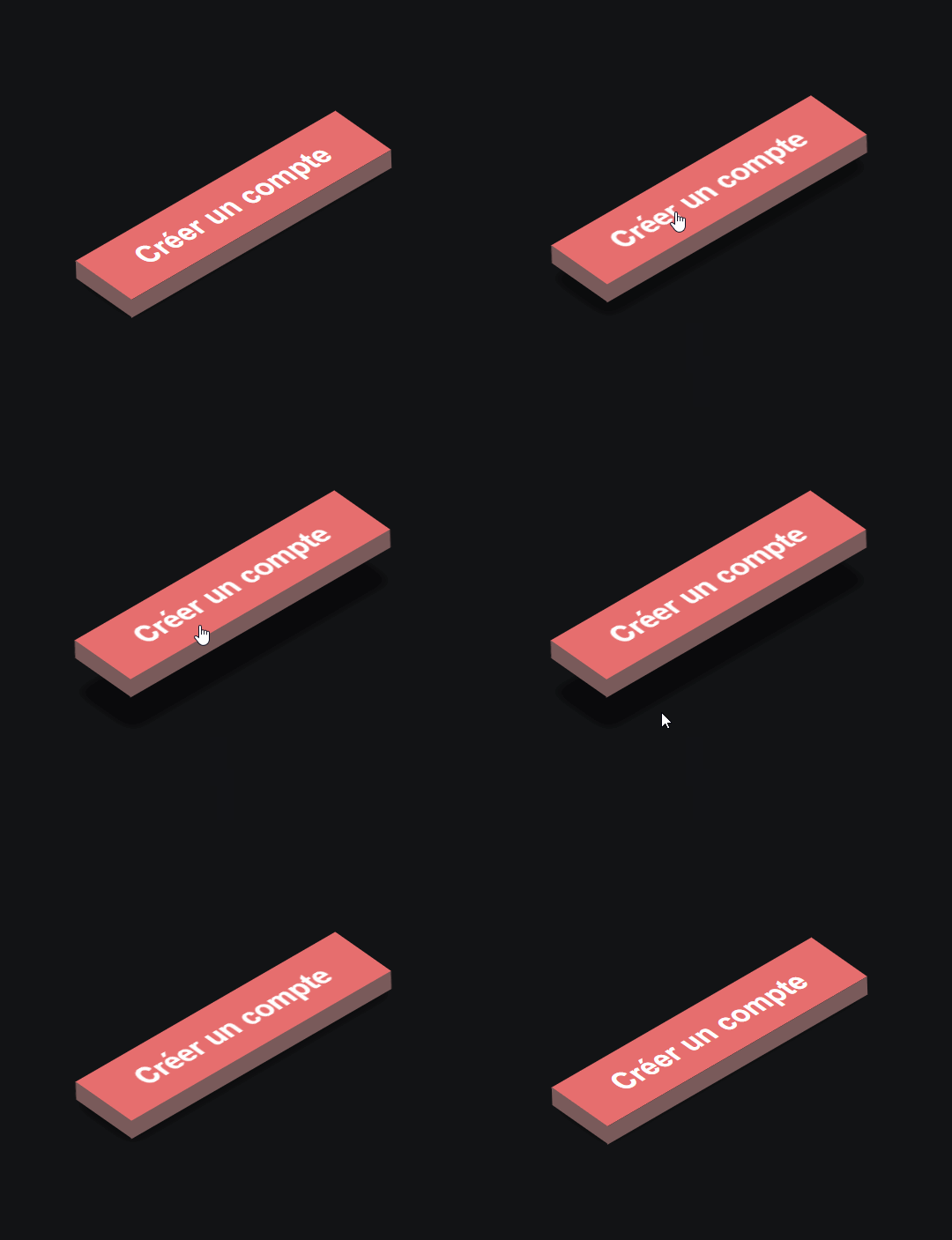
Let's discover together in this article how to create a three-dimensional button that will add a touch of softness and perspective to your projects!
Step 1
The HTML code.
<button class="btn">Create an Account</button>Why make it complicated? Coding is fun!
Step 2
Let's style the button to start.
.btn {
  width: 195px;
  height: 40px;
  font-size: 1.1rem;
  font-weight: 700;
  font-family: arial;
  cursor: pointer;
  outline: none;
  border: none;
  transform: rotate(-30deg) skewX(25deg) translate(0, 0);
  box-shadow: -10px 10px 10px rgba(0, 0, 0, 0.5);
  background: #e76f6f;
  color: white;
  transition: all .5s;
  position: relative;
}
In this step, we use very different CSS functions from what you might be used to: rotate, skewX, and translate.
Rotate()allows us to rotate the button.SkewX()allows us to "compress" the button to achieve this three-dimensional button effect.Translate()allows us to move and shift our button. For now, we initialize it to its original position, but we will modify it on hover.
Step 3
Now let's style the before pseudo-element.
.btn::before {
  content: '';
  position: absolute;
  top: 5px;
  left: -10px;
  width: 10px;
  height: 100%;
  background: #795a5a;
  transform: skewY(-45deg);
}
Here, we create the first side of our button, which will give us this true three-dimensional button effect.
We are using the skewY function instead of skewX here.
Step 4
Let's do the same with after.
.btn::after {
  content: '';
  position: absolute;
  top: 40px;
  left: -5px;
  width: 195px;
  height: 10px;
  background: #795a5a;
  transform: skewX(-45deg);
}
Attention: we use skewX and not skewY here.
Step 5
Finally, we need to lift our button on hover.
.btn:hover {
  transform: rotate(-30deg) skewX(25deg) translate(20px, -20px);
  box-shadow: -30px 30px 10px rgba(0, 0, 0, 0.5);
}
When hovering over the button, we use the translate function to lift our button 20px upwards. We specify -20px to prevent the button from shifting to the right.