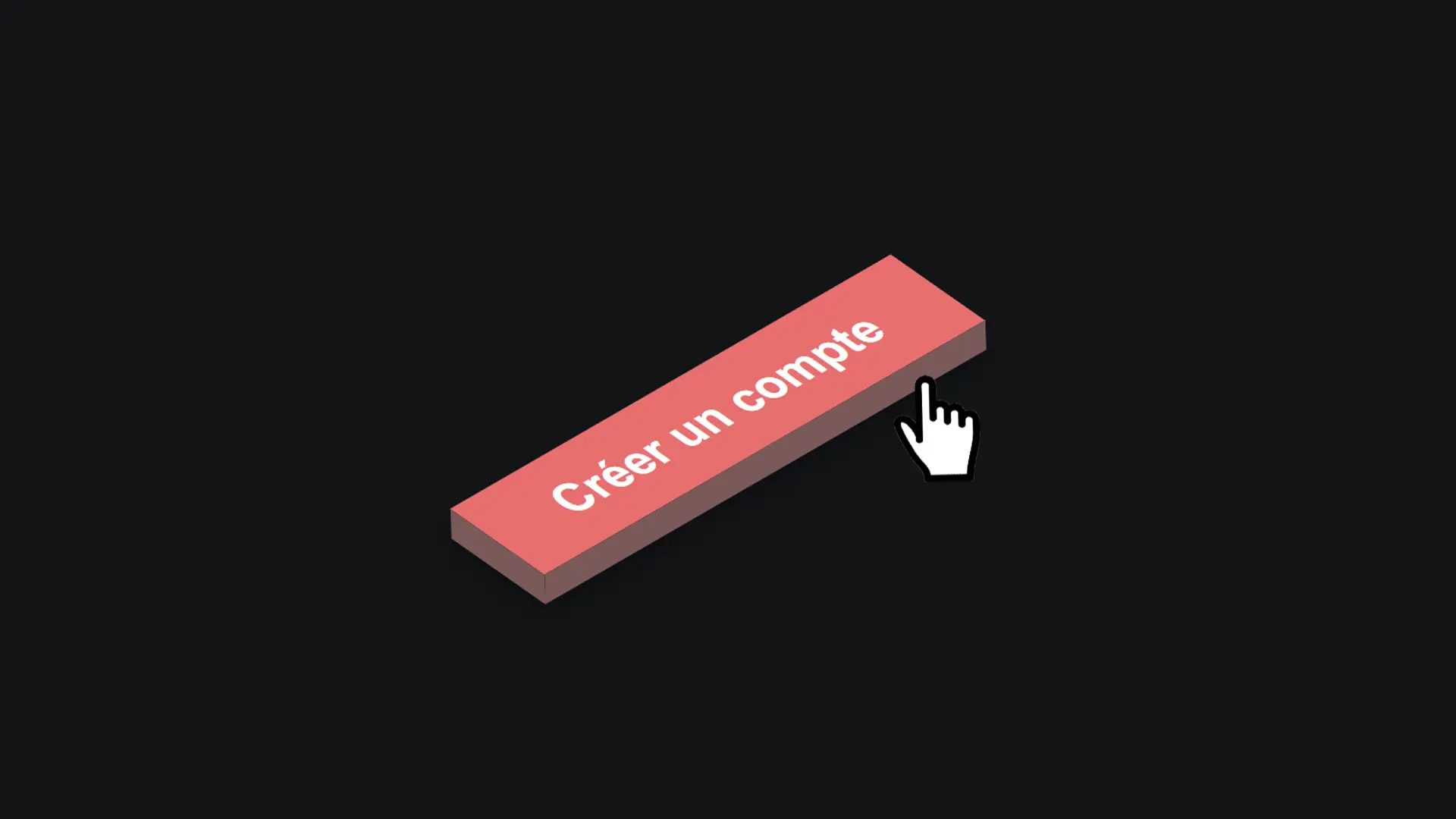
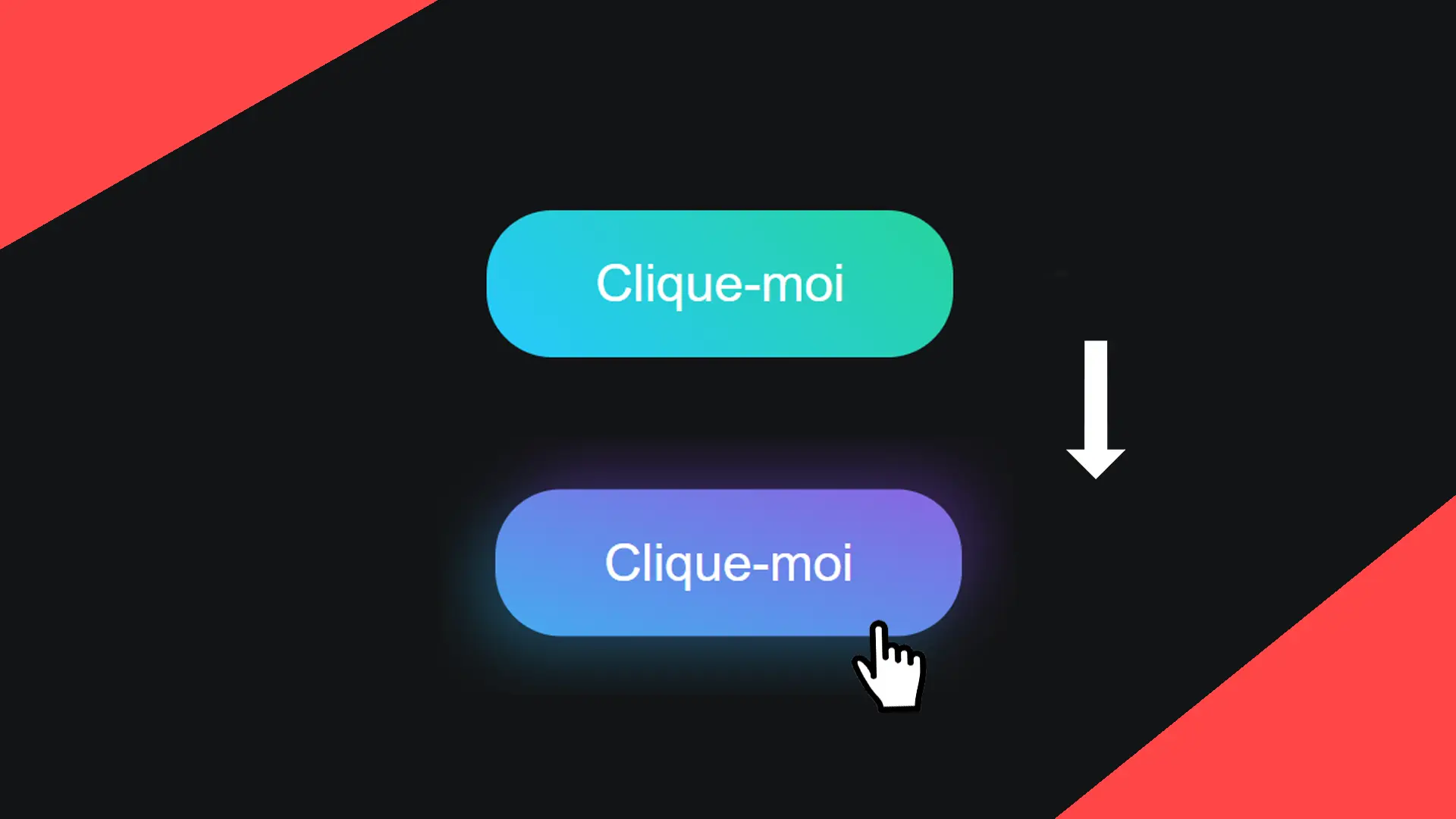
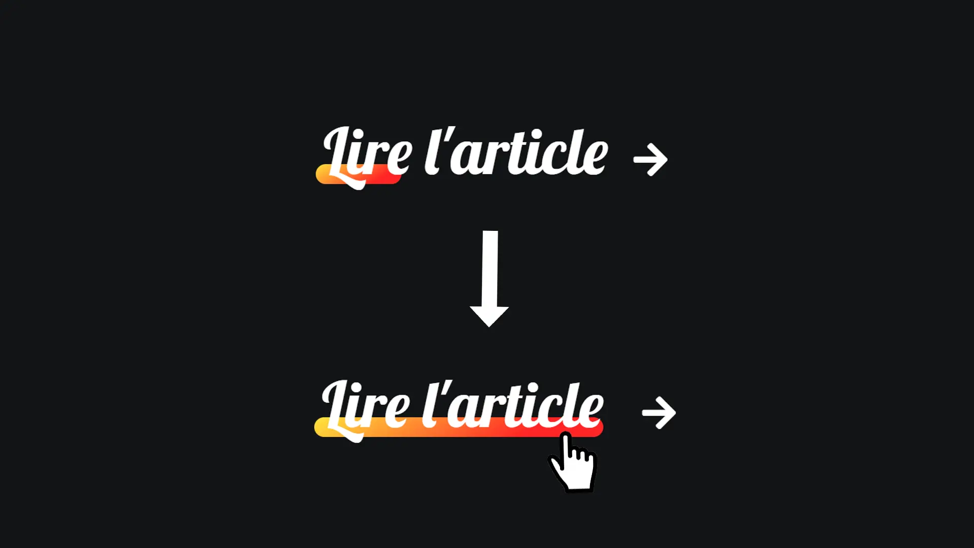
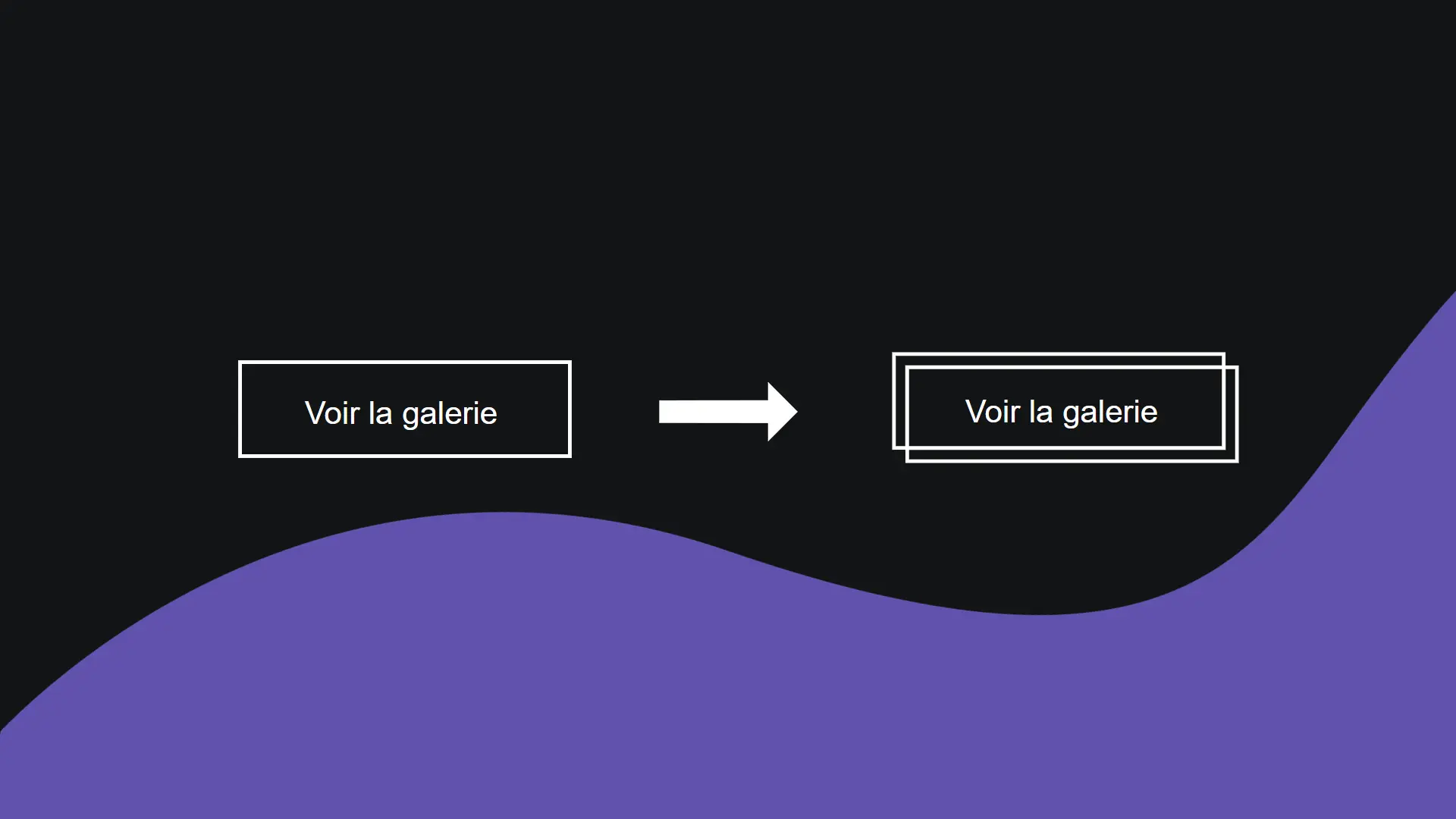
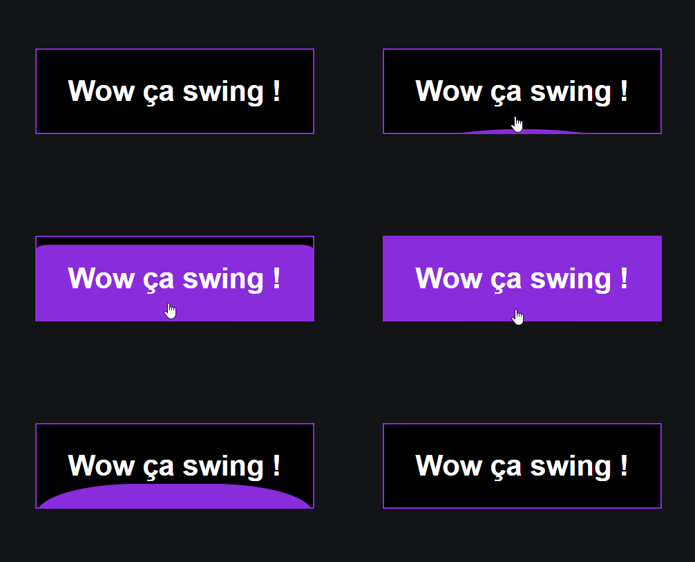
Let's discover together in this article the secret to creating this "filling" effect on a button!
Step 1
Let's start with the HTML code.
<a href="#">Wow ça swing !</a>We could hardly do anything more easy!
Step 2
Let's style the link.
a {
  width: 200px;
  height: 60px;
  font-size: 1.3rem;
  font-family: arial, sans-serif;
  font-weight: 700;
  position: relative;
  color: white;
  z-index: 0;
  border: 1px solid #892cdc;
  background: black;
  overflow: hidden;
  text-decoration: none;
  display: flex;
  align-items: center;
  justify-content: center;
}
In this step, we use flexbox (display: flex) to align the text inside our a tag horizontally and vertically.
Next, we specify that we want to hide elements that exceed our link because we are going to create a large background using the before pseudo-element.
This pseudo-element will cover the background of our button when hovering.
Step 3
Let's now style the pseudo-elements before and after.
a::before,
a::after {
  content: '';
  position: absolute;
  top: 0;
  left: 0;
  background: linear-gradient(45deg, #ff0000, #00f0f0, #00ff00, #0000ff, #ff0000, #00f0f0, #00ff00, #0000ff, #f00f0f);
  width: 100%;
  height: 100%;
  transform: scale(1.02);
  z-index: -1;
  background-size: 500%;
  animation: animate 20s infinite;
}
In this step, we create two elements using the pseudo-elements before and after.
These two elements have a multicolor background that we enlarge by 500% to keep the most beautiful part.
We increase the size of our elements using the transform property by 2%, which allows us to give the impression of already having rainbow borders on our element.
Step 4
Let's finish styling the link on hover.
a:hover::before {
  top: 0px;
  border-radius: 0;
}
When we hover over our button, we gradually display the pseudo-element and change its rounded corners to rectangular corners.
Here is the secret to creating this filling effect.