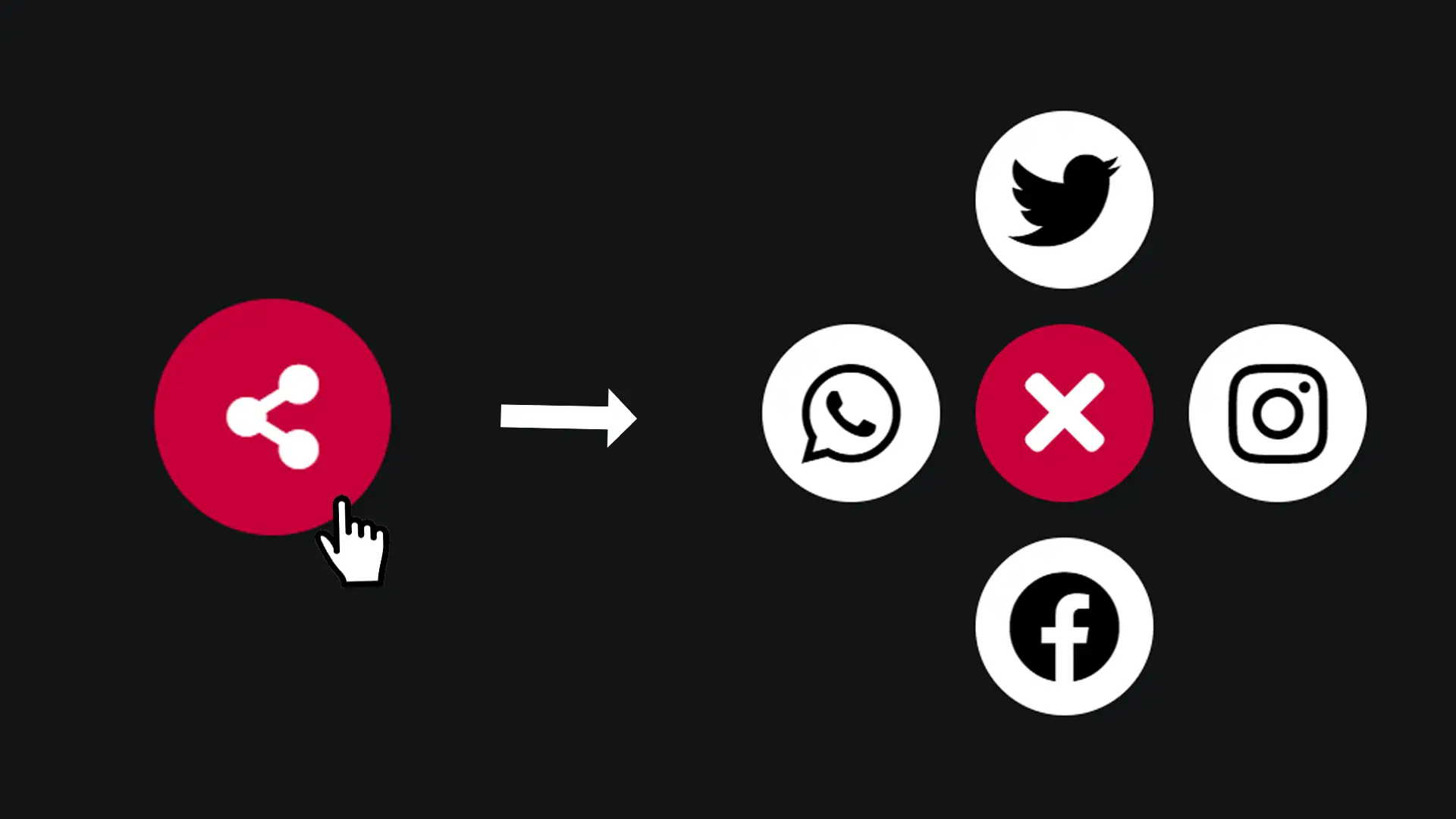
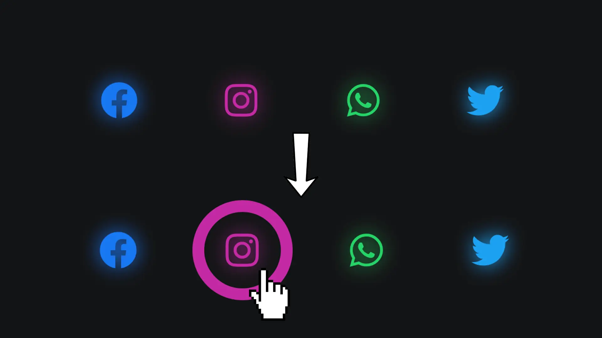
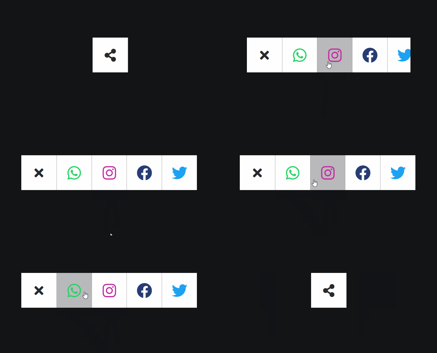
For your blog articles or on pages that showcase your projects from a portfolio, presenting a modern and non-intrusive button to allow your visitors to share your website or visit your social networks is ideal. Let's see how to create this type of button together in this article.
Step 1
Include Font Awesome.
<link rel="stylesheet" href="https://cdnjs.cloudflare.com/ajax/libs/font-awesome/5.15.1/css/all.min.css">To display social network icons, we will use a library made for that: Font Awesome!
Step 2
Time for HTML!
<div class="box">
  <input type="checkbox" id="checkbox" />
  <div class="menu">
    <a href="#">
      <div class="menuItems">
        <i class="fab fa-whatsapp"></i>
      </div>
    </a>
    <a href="#">
      <div class="menuItems">
        <i class="fab fa-instagram"></i>
      </div>
    </a>
    <a href="#">
      <div class="menuItems">
        <i class="fab fa-facebook"></i>
      </div>
    </a>
    <a href="#">
      <div class="menuItems">
        <i class="fab fa-twitter"></i>
      </div>
    </a>
  </div>
</div>
Each fab class is a class used by Font Awesome.
This library will automatically handle displaying the icons at the places where we declare our classes.
Do you already see the trickery?
We will simply declare the first element (before) towards the top left, and the second (after) towards the bottom right. This will give the impression that our button's borders are doubling.
Step 3
Let's now style the box class and the checkbox.
.box {
  display: flex;
}

#checkbox {
  width: 65px;
  height: 65px;
  cursor: pointer;
  appearance: none;
  -moz-appearance: none;
  -webkit-appearance: none;
  outline: none;
  background: white;
  position: relative;
}
#checkbox:hover {
  background: rgba(255, 255, 255, .7);
}
Step 4
Let's move on to the before element.
#checkbox::before {
  content: '\f1e0';
  position: absolute;
  top: 50%;
  left: 50%;
  transform: translate(-50%, -50%);
  font-family: 'font awesome 5 free';
  font-weight: 700;
  font-size: 1.5rem;
  color: rgb(41, 41, 41);
  transition: all 1.5s;
}
#checkbox:checked::before {
  content: '\f00d';
}
#checkbox:checked ~ .menu {
  width: 264px; /* 4 * 65 + 4 * 1 for the border */
}
When we write “\f1e0” or “\f00d”, it is actually a Font Awesome code to indicate that we want a share icon and a cross.
The share icon is displayed when we have not clicked on our checkbox.
The cross icon is displayed when we have clicked on it.
This allows us to tell our user that they can close the menu. They appear because we are using the Font Awesome font “font awesome 5 free”.
Step 5
Let's style the menu.
.menu {
  width: 0;
  display: flex;
  overflow: hidden;
  transition: all .5s;
}
.menu .menuItems {
  width: 65px;
  height: 65px;
  background: white;
  border-left: 1px solid rgb(165, 165, 165);
  display: flex;
  justify-content: center;
  align-items: center;
}
.menu .menuItems:hover {
  background: rgba(255, 255, 255, .7);
}
Step 6
All that's left is to change the color of each icon.
.menu .menuItems i {
  font-size: 1.8rem;
}
.fa-whatsapp {
  color: #25d366;
}
.fa-instagram {
  color: #c32aa3;
}
.fa-facebook {
  color: #273c75;
}
.fa-twitter {
  color: #1da1f2;
}