Create a live counter of Instagram followers

Here's how to create a live Instagram follower counter that updates automatically every second! Very useful for your websites! We're using the very latest JavaScript feature: fetch!
•
Updated on August 14, 2026
•
2 min read
Believemy logo

Creating a button is great! But creating a button that your visitors want to click is another story. This neon-style button will definitely catch the eye of everyone who visits your pages.

You can find the entire tutorial on our Instagram account.


Step 1

Let's start with the HTML code.

HTML
<a href="#">
      <span></span>
      <span></span>
      <span></span>
      <span></span>
      Neon button
</a>


Step 2

Before continuing, let's ensure that none of our elements have padding issues.

CSS
*{
    margin: 0;
    padding: 0;
    box-sizing: border-box;
}

This little trick ensures that all elements on the site (*) should include their padding in their size (this avoids many issues).


Step 3

Now let's style our link.

CSS
a{
    position: relative;
    padding: 25px 30px;
    margin: 40px 0; color: #03e9f4;
    text-decoration: none;
    text-transform: uppercase;
    transition: 0.5s; letter-spacing: 4px;
    overflow: hidden; margin-right: 50px;
}

a:hover{
    background: #03e9f4; color: #050801;
}


Step 4

Now let's style the first span tag.

CSS
a span{
    position: absolute;
    display: block;
}

a span:nth-child(1){
    top: 0;
    left: 0;
    width: 100%;
    height: 2px;
    background: linear-gradient(90deg,transparent,#03e9f4);
    animation: animate1 1s linear infinite;
}

The edges of the button don't really move clockwise: these are actually 4 span tags that appear and disappear successively one after the other.

If you're having trouble with the next step in creating an animation, you can learn how to do it through this specially created video: Easily Create Animations (CSS).


Step 5

Let's handle the first animation.

CSS
@keyframes animate1{
    0%{
        left: -100%;
    }
    50%,100%{
        left: 100%;
    }
}

Here, we specify that the span tag gradually appears from the left to the right, creating this illusion.


Step 6

Let's start over for the second span tag.

CSS
a span:nth-child(2){
    top: -100%; right: 0;
    width: 2px; height: 100%;
    background: linear-gradient(180deg,transparent,#03e9f4);
    animation: animate2 1s linear infinite;
    animation-delay: 0.25s;
}

@keyframes animate2{
    0%{ top: -100%; }
    50%,100%{ top: 100%; }
}


Step 7

Let's continue with the third span tag.

CSS
a span:nth-child(3){
    bottom: 0;
    right: 0;
    width: 100%;
    height: 2px;
    background: linear-gradient(270deg,transparent,#03e9f4);
    animation: animate3 1s linear infinite;
    animation-delay: 0.50s;
}

@keyframes animate3{
    0%{
        right: -100%;
    }
    50%,100%{
        right: 100%;
    }
}


Step 8

Let's finish by doing the same with the fourth span tag.

CSS
a span:nth-child(4){
    bottom: -100%;
    left: 0;
    width: 2px;
    height: 100%;
    background: linear-gradient(360deg,transparent,#03e9f4);
    animation: animate4 1s linear infinite;
    animation-delay: 0.75s;
}

@keyframes animate4{
    0%{
        bottom: -100%;
    }
    50%,100%{
        bottom: 100%;
    }
}
Category: Developers

Share this article

Want to help us? Share this article on your networks or even better: on your site, in an article or in your newsletter.

Believemy logo
Comments (0)

You need to be logged in to comment on this article: log in or sign up.

Read next

Display a number progressively on a counter with JavaScript

When we have numbers to display, we often present them blandly and without animation. And yet: creating an animation that progressively displays the final number is very easy to do and will enable you to liven up your numbers! Let's see how in this article.

December 11, 2024

Creating a clock using JavaScript

Imagine a clock that shows the time to your users, on a travel site for example, with the time zone of the destination country? Let's create this magnificent clock together, using JavaScript!

December 9, 2024

Create a playback progress bar

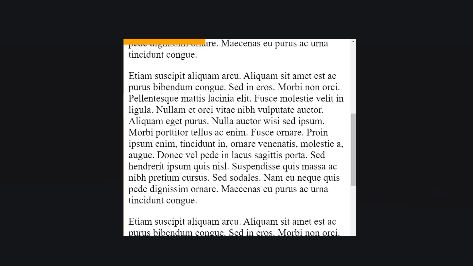
Whether you have a blog or content to read, offering a reading progress bar is really necessary for the comfort of your users. This article will show you how!

December 6, 2024

Automate the date of your footer

On 1 January, we often have other things to do than change the date in the footer of our sites... So let's use JavaScript or PHP to automate it!

December 9, 2024

Create a character counter in an input with JavaScript

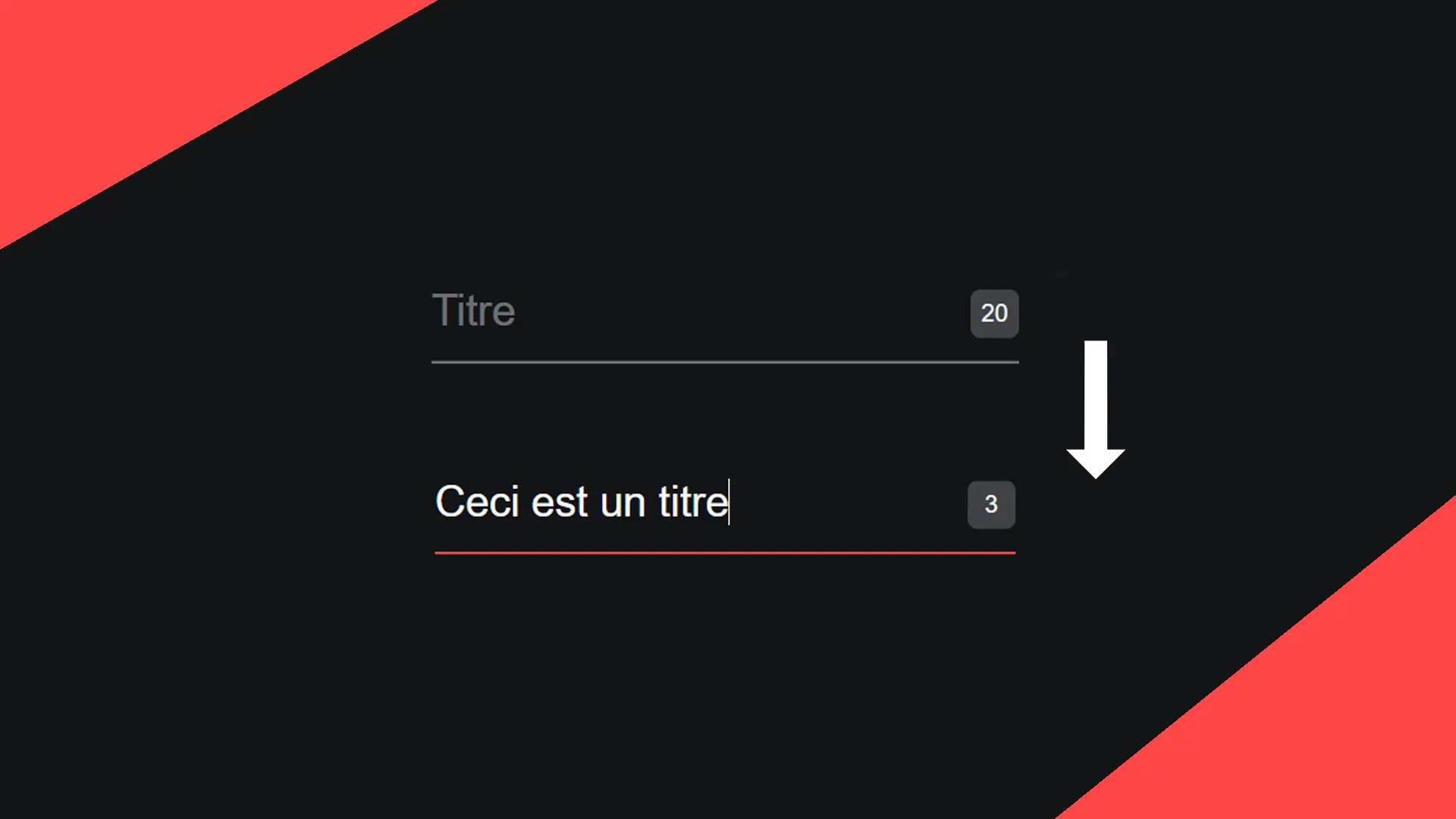
Whether it's for choosing a nickname or for any other important data, you may need to limit the number of characters your users can enter in a form field. In this article, we'll look at how to do this simply and effectively.

December 9, 2024

How can you use CSS variables to make everything more dynamic?

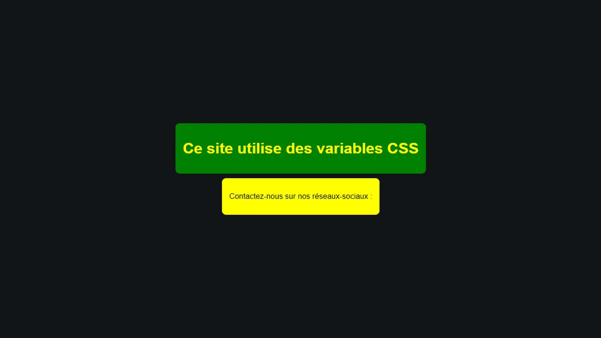
Perhaps you've already had that moment when you wanted to change the main colour of one of your projects? Or perhaps you've already experienced those moments when you go back to retrieve the colours of your site's theme? It's all very time-consuming and impractical. Thanks to CSS variables, this will be a thing of the past! Let's find out how.

December 9, 2024

Create a share button pasted at the bottom of the page with CSS

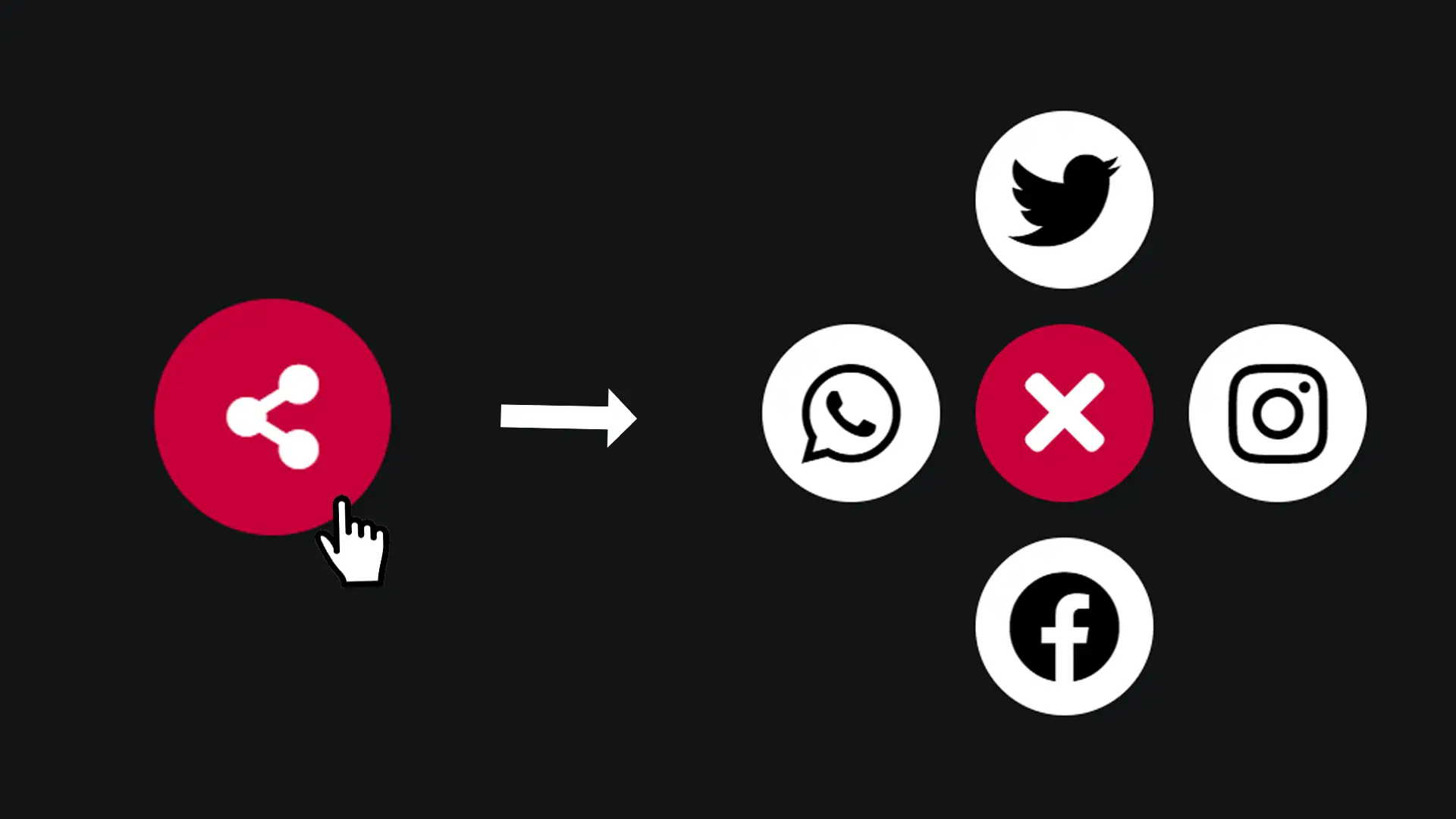
Displaying a social networking sharing button on your site helps to increase the number of visits. Nowadays, it has become essential to offer this kind of button whenever we publish articles or project presentations. Let's find out how to set up this kind of button in this article!

December 9, 2024

Make an animated notification message with JavaScript

Whether it's to quickly warn your users that a feature of your site is not yet available or to let them know that an action has been successfully completed, notifications are the simplest and most modern way to set up. Find out how in this article!

December 9, 2024

Become the solopreneur you dream of being.

First project, career change, business launch: access our courses, practice on real-world cases, and move forward with clear guidance.