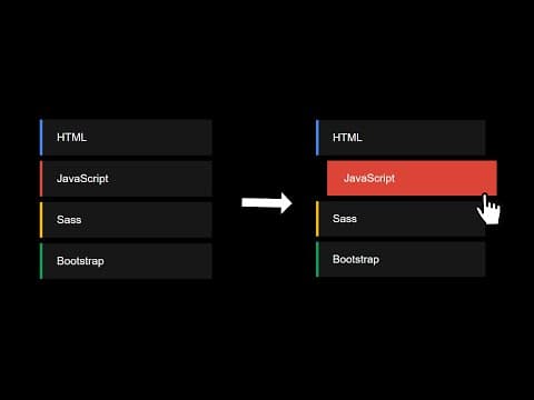
Découvrons ensemble comment réaliser une liste animée au survol !
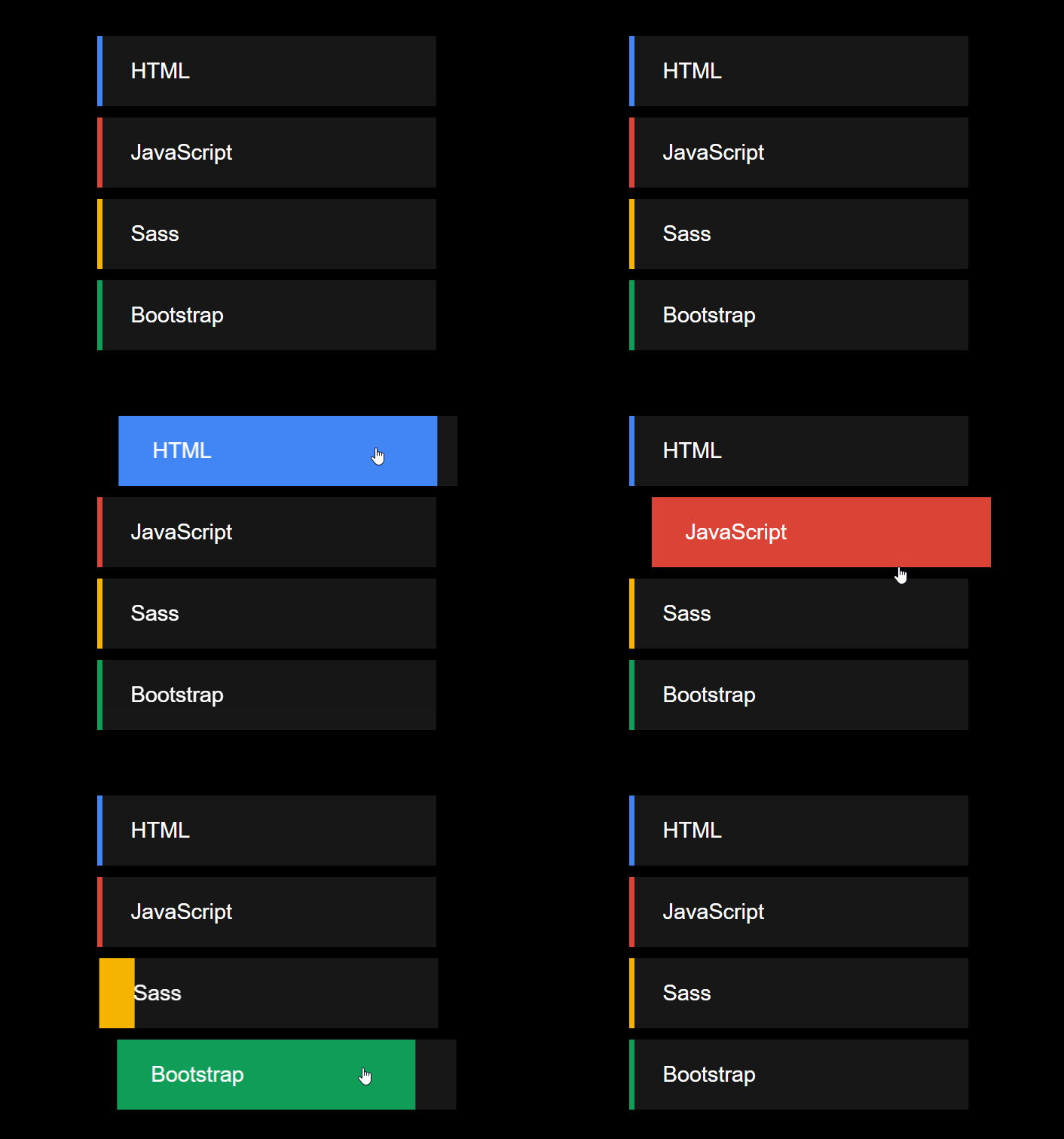
1ère étape
Occupons-nous du HTML.
<ol>
  <li>HTML</li>
  <li>JavaScript</li>
  <li>Sass</li>
  <li>Bootstrap</li>
</ol>
Nous avons juste besoin d’une liste ! (Etonnant n’est-ce pas ?)
2ème étape
Passons au CSS et stylisons la liste.
ol {
    width: 300px;
    list-style: none;
}

ol li {
    font-size: 1.2rem;
    padding: 20px 30px;
    margin: 10px 0;
    background: rgb(23, 23, 23);
    z-index: 5;
    position: relative;
    cursor: pointer;
    transition: all .4s;
}
Nous donnons à notre liste une allure simple : elle ne dispose pas de puces et nous faisons en sorte de ranger chaque item de la liste dans un block à part entière avec des marges et un background.
Le z-index: 5 nous permettra dans la prochaine de superposer la petite bordure sur le côté gauche par rapport au texte, sans que celle-ci recouvre l’ensemble de l’item au survol (il s’agit en fait un pseudo-élément before).
3ème étape
Stylisons maintenant la bordure.
ol li::before {
    content: "";
    position: absolute;
    top: 0;
    left: 0;
    width: 5px;
    height: 100%;
    z-index: -1;
    transition: all .4s;
}

ol li:hover::before {
    width: 100%;
}
4ème étape
Définissons une couleur différente pour chaque élément de la liste.
ol li:nth-child(1)::before {
    background: #4285f4;
}

ol li:nth-child(2)::before {
    background: #db4437;
}

ol li:nth-child(3)::before {
    background: #f4b400;
}

ol li:nth-child(4)::before {
    background: #0f9d58;
}
5ème étape
Décalons pour finir l'élément de la liste quand il est survolé.
ol li:hover {
    transform: translateX(20px);
}